

 Inside the Briefcase
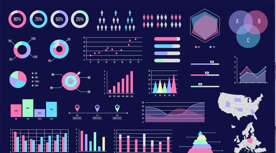


Business Intelligence: Intuitive vs Cool Data Visualization and Infographics
April 22, 2011 No CommentsSex sells. And, although it may seem absurdly out of context, it definitely sells Business Intelligence (BI) software.
Though somewhat ironic, many BI purchase decisions are made on abstract (or outright flimsy), rather than tangible benefits-based grounds. – A stunning interface, fancy shapes or colors, can push one Philly over the line in a close two-horse race.
At Yellowfin, we’re about to release the latest version of our BI solution – Yellowfin 5.2. Amongst other enhancements and additions, the update will include a number of new charting options. And whilst their aesthetic appeal is undeniable, we think it’s important to understand their purpose and place.
Confabulation in Business Intelligence and data visualization
Jim Harris, in a recent Information Management blog post – Data Confabulation in Business Intelligence – stated that in an environment of forever avalanching data assets, he feared a new trend. His fear was that: “data-driven decision-making may simply become intuition-driven decisions validated after the fact by selectively choosing the data that supports the decision already made. The human mind is already exceptionally good at doing this – the term for it in psychology is confabulation.”
He explained that: “Data confabulation in Business Intelligence occurs when intuition-driven business decisions are claimed to be data-driven and justified after the fact using the results of selective post-decision data analysis.”
I concur with Harris, and hold a similar fear for data visualization – that this component of BI is also being applied improperly. My fear is two-fold:
- Amidst a growing, cluttered, swirling sea of BI products, organizations looking to select a BI solution will move through a mountainous number of POCs (Proof of Concept) and emerge utterly confused by a combination of expansive choice, and myriad of sweet-smelling vendor promises. Spoilt (and understandably perplexed) for choice – a choice that business users now have a larger say in (as they should) – many organizations’ ultimate purchase decision will be based on which vendor generates the prettiest 3D pie chart, rather than which BI solution (and visualizations) can provide the best-fit (clearest insight).
- Decision-making will suffer. Decision-makers, report users and writers alike, will be caught up in the euphoria of spiffy-looking infographics that carry meagre meaning, but project the impression of authority and decisiveness. This infatuation with the superficial will lead to the utilization of inappropriate, less incisive data visualizations, misunderstandings/misinterpretation (or at the very least, lesser understandings) of the underlying data, and poorer decisions.