
 Inside the Briefcase
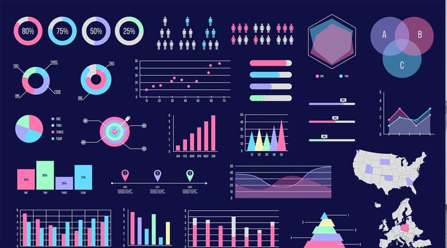


Title: Using Powerpoint Templates to Communicate Your Data
May 21, 2020 No CommentsFeatured article by Logan S., Entrepreneur and Writer at SlideModel

Is my data memorable? With the generation of large amounts of data in an array of business processes, data visualization has emerged as a pivotal part of any PowerPoint presentation. Often comes the time when you’re required to display large amounts of data to your audience. You might be an employee finding yourself in need to present sales data to your director, research teams looking to display proof of concepts to investors or an educator displaying statistics to the students, data visualization is everywhere. In a nutshell, your PowerPoint presentation should be able to communicate data to your audience in a functional and attractive manner. This adds an extra dimension to your presentation since the audience is now more likely to relate to the topic more. Effective data visualization can be achieved by utilizing graphs, charts and infographics.
With a great position comes great responsibility. When you have to process such a huge collection of data, you will have to take care of many crucial aspects. For instance, you’ll have to introduce insane focus and simplify the data for your viewers. In simpler terms, which data part to focus on the slide and which not, can be a bit of a challenge. You will also have to create images or infographics from scratch to make your message memorable. When it comes to raw numbers, creating data-driven charts can be time-consuming as well. Generally, people are short on time or don’t have much expertise when it comes to dealing with raw analytical data. Well, worry not! You can always use a readymade PowerPoint template specifically meant to showcase data. Don’t let your audience do mental math and draw their own conclusions, present them data in an engaging way.
How does the PowerPoint template help in data visualization?
As far as data visualization through PowerPoint templates is concerned, you should understand that different rules apply in different contexts. In other words, a design consultant pitching a proposal to a potential client is entirely different from a vice president presenting financial projections to a group of senior managers. Context should be defined before you even start creating a presentation. In some cases, you might have to showcase details that led you to certain conclusions, while in other cases, you’d just have to show the conclusions and not many details. Since your slides will be up there for a few seconds only, your audience will have to quickly process the data. For that, you need an attractive and lucid PowerPoint template.
Using infographics:
Inculcating infographics in your presentation can evoke great storytelling within your presentation. With the help of infographics, you can lead your viewers right from the beginning to the end of a presentation topic by guiding them from one point to another. Since infographics are great storytellers, it will be easier for you to keep your audience engaged and get your message across everybody. Always remember that a cluttered or dull slide won’t win you any admirers. You can use infographics provided within PowerPoint templates and can start putting-in your data and create the perfect infographic in no time. It is only then that your audience will want to know what your message is and is it even worth listening to!
Determine the right chart or table:
Every data is different. You can’t use one type of chart, table or infographic with every dataset since data has its own dimensions. When you transform data into its visual representation, you should decide what kind of relationship you want to emphasize with your viewers. For instance, a pie chart can be helpful when there is just one dimension to your data such as names of investment portfolios. You can’t deduce anything more than that. However, when the same data is provided in a bar chart, you get two dimensions. You can display the names of investment portfolios as well as the percentage of investors investing in them. It is intriguing how one chart helps in bringing much-needed clarity to a sea of data.
Present information in stages:
To make it less intimidating for your viewers, you should try to make it a habit to animate your charts before you project them. This enables your audience to deduce the chart better. In simpler terms, rather than presenting them the zig-zag chart out of nowhere. You can animate the process by explaining the axes first, then metrics on the X-axis are plotted and explained and vice-versa. This helps the audience develop a relation between the X & Y axis in their minds. And it’s after this, you can project the line, curve, zig-zag pattern etc. PowerPoint templates come with added animations which are a blessing to human eyes. However, too much animation can make your audience lose interest. Thus, keep it simple, lucid and attractive.
Today, the digital world is plagued by the content overload. It has become a consuming issue for everybody. Since there is too much information in the form of text and numbers and readership is only limited. Especially in presentations, the audience’s attention span is coveted. You need templates which can seamlessly highlight trends & crucial data by leveraging charts, tables, diagrams and infographics, all best suited for your presentation topic. By following this, you can generate a unique engagement with your audience.
You can easily make your viewers deduce key points of the presentation such as the most striking comparison you’re making, what are the latest trends, how is the company performing for the last couple of quarters and much more. Moreover, this whole process can be customized to the core. With data-oriented PowerPoint templates, you can change backgrounds, alter contrast ratio, scale up or down visual presentation elements, thus, you can create a hierarchy of rich visual slides. In the end, your viewers will find it easy to navigate the dense data and will also be able to retain key pieces of data.
About the Author
Logan is a digital nomad entrepreneur and writer at SlideModel. When he is not writing online, you can find him designing presentations or running a half marathon outside.


Sorry, the comment form is closed at this time.